Get Inspired With These Colour Palettes For Your Home
by Yellow
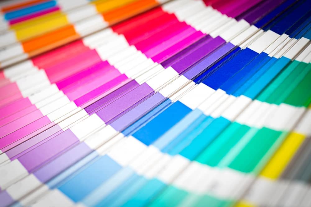
Pantone's done it again! Year after year, every since the year 2000, Pantone has declared a colour of the year along with an appropriate colour scheme per season. With Spring coming up, we thought it would only be appropriate to share with you the 10 colours Pantone recommends you adopt to your house this coming Spring!
Primrose Yellow
They say yellow is the colour of happiness so why not spread joy with your colour scheme! Adopt this burning yellow to your walls to guarantee a smile on your face everytime you step into a room.
Pale Dogwood
Reconnect with your feminine side, step out of the convention and adopt a lemonade pink to your palette. Whether it's your walls you're painting in Pale Dogwood or your furniture, we're sure the colour will look gorgeous in your home!
Hazelnut
We find Hazelnut to be an especially beautiful shade for your textiles. Adopt this colour to your sheets or curtains to ensure your home is always looking fresh and classic. You can't go wrong with this colour!
Island Paradise
There's something about this colour that makes furniture look vintage and rooms looklively! If that's the aura you're aiming for, Island Paradise is the colour for you!
Greenery
Are you an environmentalist? This next colour is named especially for you! Greenery is a flawless colour when it comes todecor such as sofas, chairs and lamps.
Flame
Feel like striking a flame of passion in your house? Equip your colour scheme with Flame. This fierce red colour is not only empowering but also simply stunning. Painting your front door in Flame will definitely send a message to anyone who knocks at your door.
Pink Yarrow
I'm a Barbie girl, in a Barbie world… Pink Yarrow gets us humming that song everytime we spare it a glance. This colour is a risky one, but if you're up for the challenge; we're sure your choice will pay off!
Niagara
Inspired after theniagara falls, the Niagara shade is absolutely beautiful when it comes to sofas, vases and textiles. Although we don't recommend it for your walls, due to its dark nature, if you prefer dark surroundings; it might just do the trick for you!
Kale
With Kale being on pretty much every menu in America, we shouldn't be surprised it has earned a spot in colour schemes too. This kale shade is beautiful when colour blocked against a bright colour. Try it!
Lapis Blue
Your house can now be as blue as the stone this last colour ismodeled after! Opt for a lapis blue when looking for a pop of colour in your rooms. This shade is risque enough to offer some charm to your home but safe to the point of being foul-proof.
We can't wait for Spring to come along so we can incorporate some of these colours to our scheme. What do you think?